Descendant tree drawing problem
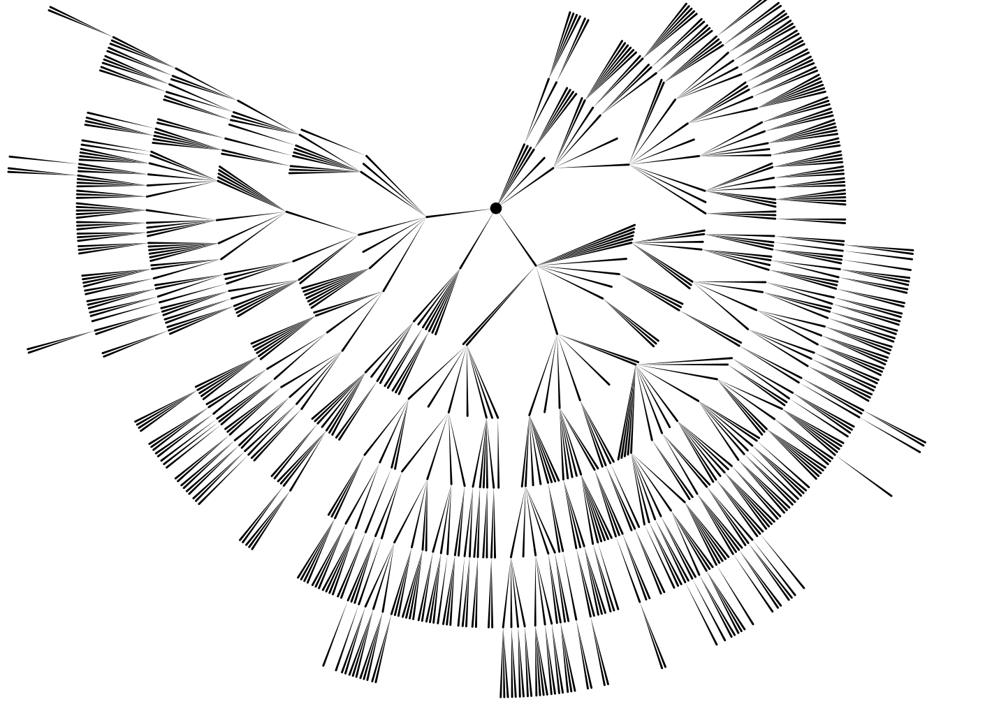
For a geneaology project of my familiy, I generated this fairly straight forward drawing of my Grand-Grand-Grand-Grandfather’s descendants (click for full image):
Unfortunately, this representation does not give any information about when someone lived, or how long. I tried to add this information to the graph, and I coudn’t think of anything better than drawing each person as a rectangle whose upper edge lies above the parent’s rectangle, and whose height and vertical possition represent the life span. This is the result (here you really have to click for a full view):

This is obviouly not very helpful. Does anyone have a better idea how to draw this?
By the way, these graphs are generated using haskell and the cairo bindings provided by gtk2hs − very handy, as I also get svg output and pdf output for free.
Comments
You want to use
{ rank=same ...}
blocks to achieve your desired ordering.
digraph ft {
{
node [shape=plaintext, fontsize=16]
1880 -> 1890 -> 1900 -> 1910 -> 1920 -> 1930 -> 1940 ->
1950 -> 1960 -> 1970 -> 1980 -> 1990 -> 2000 -> 2010
GFF_b [group=GFF];
GMF_b [group=GMF];
GFM_b [group=GFM];
GMM_b [group=GMM];
MO_b [group=MO];
FA_b [group=FA];
CH1_b [group=CH1];
CH2_b [group=CH2];
CH3_b [group=CH3];
}
{
node [style=invis]
GFF_d [group=GFF];
GMF_d [group=GMF];
GFM_d [group=GFM];
GMM_d [group=GMM];
MO_d [group=MO];
FA_d [group=FA];
CH1_d [group=CH1];
CH2_d [group=CH2];
CH3_d [group=CH3];
}
/* timeline */
{ rank = same; 1880; GFF_b; }
{ rank = same; 1890; GMF_b; GFM_b }
{ rank = same; 1900; GMM_b; }
{ rank = same; 1930; FA_b; }
{ rank = same; 1940; MO_b; }
{ rank = same; 1960; GFF_d; CH1_b; CH2_b }
{ rank = same; 1970; GMF_d; CH3_b }
{ rank = same; 1980; GFM_d; }
{ rank = same; 1990; GMM_d; }
{ rank = same; 2010; FA_d; MO_d; CH1_d; CH2_d; CH3_d}
/* lifelines */
GFF_b -> GFF_d [dir=none,style="setlinewidth(9)"];
GMF_b -> GMF_d [dir=none,style="setlinewidth(9)"];
GFM_b -> GFM_d [dir=none,style="setlinewidth(9)"];
GMM_b -> GMM_d [dir=none,style="setlinewidth(9)"];
FA_b -> FA_d [dir=none,style="setlinewidth(9)"];
MO_b -> MO_d [dir=none,style="setlinewidth(9)"];
CH1_b -> CH1_d [dir=none,style="setlinewidth(9)"];
CH2_b -> CH2_d [dir=none,style="setlinewidth(9)"];
CH3_b -> CH3_d [dir=none,style="setlinewidth(9)"];
/* descendant lines */
GFF_b -> FA_b;
GMF_b -> FA_b;
GFM_b -> MO_b;
GMM_b -> MO_b;
FA_b -> CH1_b;
FA_b -> CH2_b;
FA_b -> CH3_b;
MO_b -> CH1_b;
MO_b -> CH2_b;
MO_b -> CH3_b;
}
identify /tmp/dotgraph.png /tmp/dotgraph.png PNG 74698x2061 74698x2061+0+0 DirectClass 1.9mb 15.540u 0:17
Obviously I can’t open that file. If I make dot write a pdf file, I can actually read that file, but it’s just too large. I doubt that I can get around writing my own implementations − which is not a problem, I just need a better idea :-)
I'm interested in my families geneaology and have to make some reports in the near future for my family.
I think you might have more luck if you just turn the entire graph 90 degrees. counter clockwise. Then you could put the time line across the top.
Good luck and let us know how it goes
Have something to say? You can post a comment by sending an e-Mail to me at <mail@joachim-breitner.de>, and I will include it here.